
Wedding Save the Dates

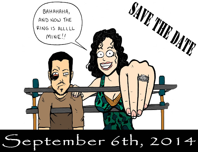
Mark played a huge role in designing our Save the Dates. He wanted it to “accurately” portray what led up to his decision to propose to me and represent what he felt the wedding would be like (obviously, a lot of tongue and cheek is being used here). His inspiration came from feeling that I won the first round of our life match (He proposed) and that the second round would be at the wedding. Guests will have to attend to see who wins that match! Maybe parenthood is the final round? Personally, I am putting my money on me!

Mark worked with his talented friend (Jeff Manley) to create the art for the front. Manley drew and Mark colored.
Save the Dates

Mark asked me to create something that was reminiscent of an “old school boxing match poster” for the back.
Save the Dates

I love how they turned out! They are very ‘us’ and a lot of fun. I am so glad that we are mixing traditional and very personal elements within every aspect of our wedding.

Comments

Popular posts from this blog

Wedding Felt Animal Masks

Sarah redesigned the animal masks for me and I could not be more pleased with the results (we are referring to them as the chibi versions)! They are much more appropriately proportioned for smaller faces and printing ease. She even remade all of the patterns for me!  Head over here to see how I made my very first felt animal mask.  This is going to be a long post, as I am going to share all of them here. However, I am not going to go into the details. This is really more of a way for me to show off Sarah's amazing designs and my hard work! Bat:   Bear:   Fox:   Giraffe:   Golden Retriever:   Hippo:   Liger:   Owl:   Panther:   Red Panda:   Sloth:   Snake:   Tiger:   Wolf: If you're interested in buying these masks or the digital templates (with instructions) to create your own, check out my Esty shop: MarstenCo !...

New House Colors

Our new home is not open concept. It has many distinct  rooms, which I'm currently loving and enjoying picking out paint colors for. I love a house with character and color, but I don't think it should overwhelm. When deciding my colors,  I chose some basic neutral grays, bieges, whites, and blacks that could be used as connecting colors throughout the house. I also made sure any connecting rooms had colors that complemented each other. Next, I determined a focal design element (painting, furniture, flooring, etc.) that helped defined the room's aesthetic and took into consideration the era the house was built in. Lastly, I used Sherwin Williams  to make personalized color schemes for each room to keep me inspired and focused. Below are the colors I've chosen for each room - don't judge until you see how phenomenally each room turned out (click the links to see)! Living Room : Dining Room : Kitchen: Library: Master Bedroom : Nursery : Guest Room: Upstairs Bathroom: ...

Nursery Remodel

There wasn't a huge need to do much more than update the paint colors and refinish the hardwood in the upstairs. But I was excited to get our son's room ready to go and inviting for him. It was the top priority when we started working on the house, as we wanted to make the transition as comfortable for him as possible.  The carpet was down when we bought the house, but outside of that, here's what we started with: If you haven't noticed, I am very partial to blues, teals, greens, grays, and oranges. I think it would be hard to leave my house without being aware of that. Hopefully, our son is into that as well! You might have noticed that his bookcases and changing table have fun backings. As He outgrew his muslin blankets and I needed to start hiding cords from him, I temporarily adhered the blankets to the backs.